Happy 2024! With a new year, comes new color trends. Design professionals look forward to the inspiration released annually from our favorite paint companies. Some of my favorites to follow are Pantone, Benjamin Moore, and Sherwin Williams. After reviewing their “2024 Color of Year” materials I noticed a very soft and nature-inspired palette.
Read on to join me, Shannon Tannehill, UDCP, Design Consultant at The Cleary Company Remodel-Design-Build in Columbus, Ohio for a review of the fresh paint tones for 2024.
Interior Color Trends
All these colors remind me of ones seen in the evening sky that range from dusk to night starting with Sherwin Williams, Upward (SW6239).
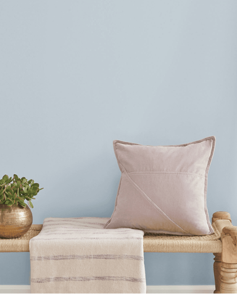
This almost pastel color blue reminds me of the sky on a summer afternoon before the sun begins to set. Soft shades are great for a bedroom, powder room, or finished basement. The coastal feel brings a sense of serenity and ocean calm while the creamy undertones of Upward are neutral enough to pair with other colors. I like these complimentary colors, also from Sherwin Williams, Drift of Mist (SW9166), Gale Force (SW7605), Sea Salt (SW6204), and Natural Linen (SW9109) to create an ocean oasis.
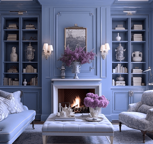
As the sun begins its descent, the next color is Blue Nova (825) from Benjamin Moore. It’s a soft, dusk sky feeling with its lavender and periwinkle undertones. It is a great accent in a primary bath or bedroom. Or paint all the walls for a delicate moody feel. But don’t just limit paint to the walls! Consider a statement furniture piece with gold or chrome hardware or a front door for a pop color anywhere in your home. Try pairing with these complimentary colors from Benjamin Moore, Topaz (070), Regent Green (2136-20), and White Dove (OC-17).
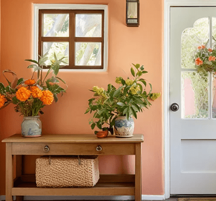
You know that time when the clouds begin to change color as the sun starts to get closer to the horizon? This next color could be pulled from this beautiful sight only found in nature. Pantone’s Peach Fuzz (13-1023) has creamy oranges with hints of pink. This is a lovely color that is reminiscent of that perfect sunset.
If you are a little timid and do not want to commit to an entire space being “peachy” add accents with pillows, rugs, and drapes for a feminine touch to introduce a not so common color. This would go great with floral wallpaper, wood tones as well as with the other colors of the year mentioned above. Other Pantone hues that pair nicely with Peach Fuzz are Honey Peach (13-1015), Pristine (11-0606), Marsala (18-1438), and Almondine (16-1415).
Once the sun has fully set, the night sky begins to creep over. Not quite black or blue but a dark grey with subtle hints of greens and browns without being too dreary. Like Urbane Bronze (SW7048) and Iron Ore (SW7069) from Sherwin Williams. I can see using this in a small space to give it warmth and dimension. Create a contrast with light almost white tones. Pair with a patterned floor or artwork to keep your eye moving through the space.
Exterior Color Trends
New color trends of using dark colors on exteriors have been gaining popularity in Columbus, Ohio. They are great for trim, garage and front doors, or even the whole house with wood accents. For example, check out this gorgeous Mid-Century Modern whole house remodel and the traditional porch addition projects we built in Upper Arlington!
Siding James Hardie Board & Batton color Grays Harbor SW 6236 & Pella Lifestyle Series Windows Black
Exterior main color Gauntlet Grey SW 7019 – trim color Tricorn Black SW 6258 – shutters Sommelier SW 7595
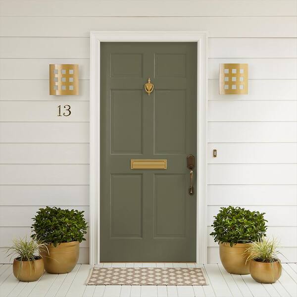
Prefer a deep green? Check out Mountain Olive from Behr Ultra for a pop of color on your front door. Classic neutral exterior colors like Chic Taupe or Weatherwood White compliment a green door nicely.
I hope you can find some inspiration for inside and outside of your home with these selections from the 2024 colors of the year. Pro tip ~ Keep in mind to go with what YOU like. These are some fun guidelines for what has been forecasted as emerging favorites for years to come.
Take a chance on something you would have never thought of with my suggestions. After all, if you decide you don’t like it, painting is an easy change. And let’s face it, we have all had to paint over the red wall in our dining room at one point. Happy Designing!
Our Remodel-Design-Build Team is ready to collaborate with you on your next project. Get started today by contacting our Client Relations Coordinator! Call 614-459-4000 or visit our website.